This is another exciting project I got to work on for the Cultural Intelligence Center with Lead Designer Tina Kessel.
For this project, I re-imagined the branding and layout of the CQ Certification Manual. It had been a long time since the design had been looked at, and many content changes were being made, so it made sense to revisit this and refresh the manual.
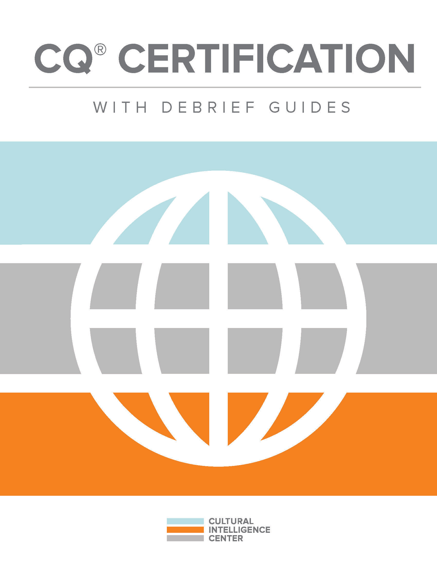
For the cover and back cover, I took four icons that represent the Cultural Intelligence Capabilities (CQ Drive, CQ Knowledge, CQ Strategy, and CQ Action, represented by a running figure, head with gears, chess piece, and movie clap board) while also incorporating the globe associated with certification and the brand colors to create a geometric grid pattern. This was simple enough that it wasn't distracting for a cover design, but also added much more visual interest than the previous manual's cover.


Above, you can see the previous design next to the updated version.
We also needed to include chapter and section dividers, which I accomplished by creating orange pages with longer dimensions so that the user can easily flip to a specific chapter of the manual, and a gray patterned section title page that signifies the beginning of a new section. I incorporated the certification globe again to add some texture to these spreads.
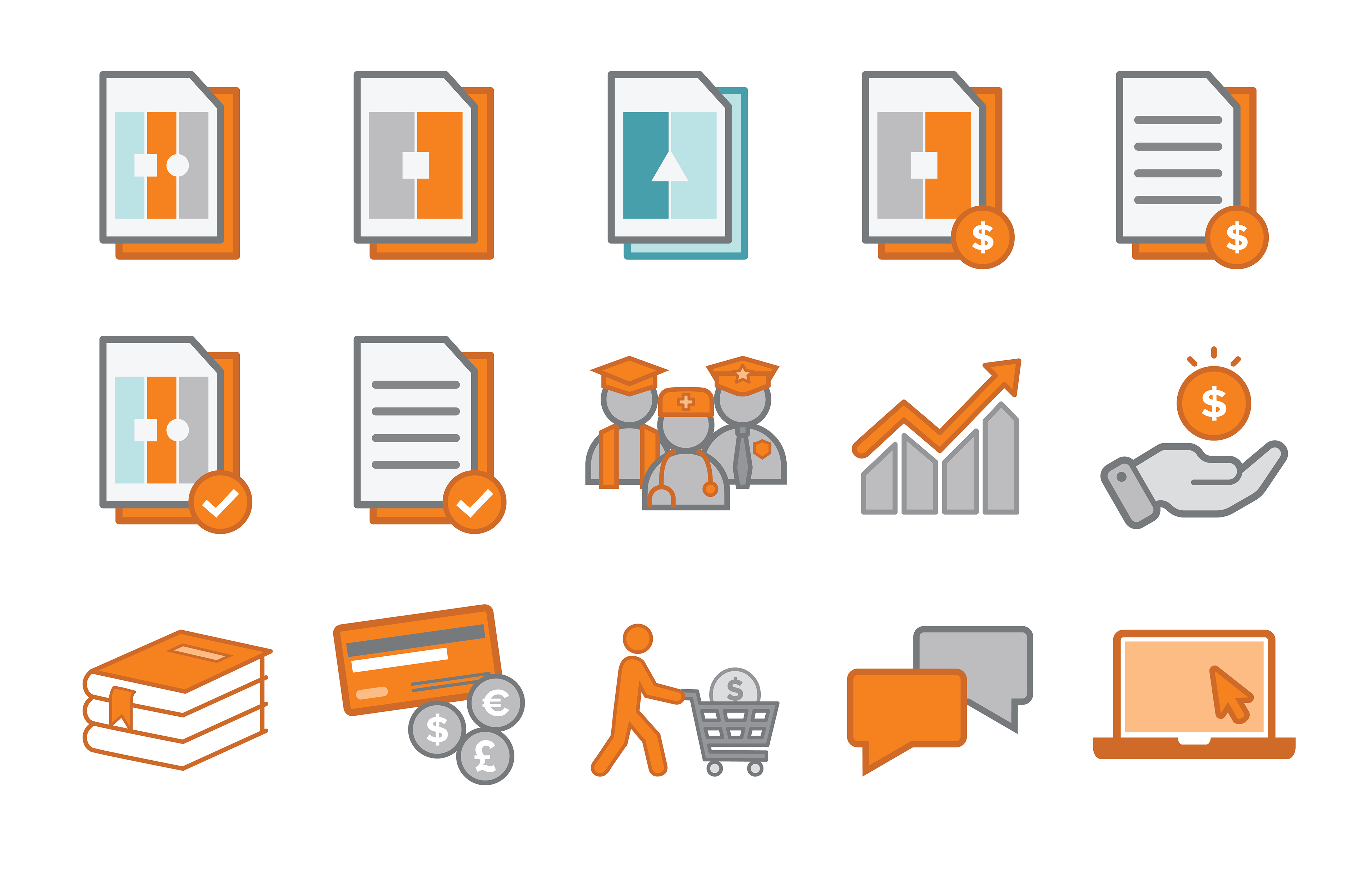
I worked with the Subject Matter Experts and my supervisor Tina Kessel to update the content of the manual before re-working the look and feel of the spreads themselves. The previous manual was completely grayscale on the inside, and it was exciting to get to breathe some life and color into this design to more closely tie it to our other materials. There were several icons used before to denote certain content, such as objectives, notes to facilitators, and feedback reports, and I redesigned those as well. Those are included below as well as a few other icons I worked on for this manual.


Overall, this was a very long project, but a very rewarding one. It was amazing to see how much more engaging the final result became. After finishing the manual, I was able to attend a Certification event in Chicago, Illinois and watch this and other materials I've worked on being used, and it was great to see. Many of the participants learned that I worked for the company and complimented the new and improved manual design.
